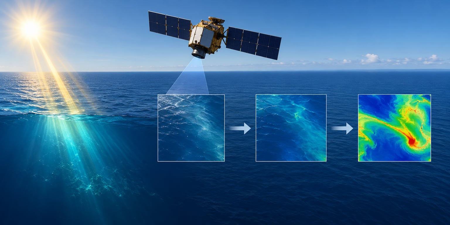
Satellite ocean color data is a measurement of sunlight that entered the ocean, was absorbed and scattered by water and everything dissolved or suspended in it, and then travelled back up to an orbiting sensor. The sensor records the spectral signature of that light, algorithms strip out the atmospheric contribution, and the remainder is inverted to estimate what is in the water.
Everything downstream — chlorophyll maps, bloom tracking, turbidity, shallow-water bathymetry — depends on that inversion being right. This guide walks the whole chain, from photons hitting the sea surface to a quality-flagged pixel you can defend in a paper, and finishes with how in-water radiometers on buoys, boats and autonomous platforms fit alongside the satellites.
Table of Contents
- How Satellite Ocean Color Data Works: From Light to Map
- What Does Satellite Ocean Color Measure?
- How Do Ocean Color Sensors Record Light?
- Why Does the Atmosphere Make Satellite Ocean Color Data Difficult?
- How Are Atmospheric and Sensor Effects Removed?
- How Does Corrected Light Become a Scientific Product?
- What Do Different Ocean Color Bands Reveal?
- How Is the Data Processed into Time Series and Maps?
- How Accurate Is Satellite Ocean Color Data?
- How Do Scientists Validate Satellite Measurements?
- How Is Ocean Color Data Used in Marine Research and Technology?
- Frequently Asked Questions
- Conclusion: Start with a Quality-Checked Product
How Satellite Ocean Color Data Works: From Light to Map
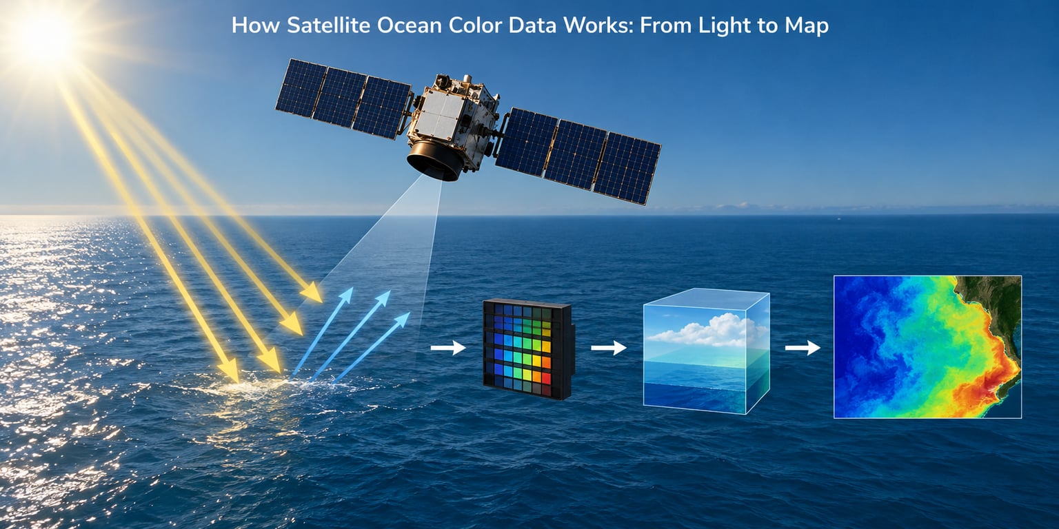
The chain has three blocks: capture, correction, interpretation. Capture gets photons into a digital number. Correction removes the parts of that number that were never about the ocean. Interpretation turns what is left into a physical variable.
The eight steps from sunlight to a map
- Solar illumination. Sunlight reaches the sea surface, some of it absorbed, some reflected straight back to space, the rest refracted into the water.
- Atmospheric transmission. The light that enters the water first passes through the whole atmosphere. Rayleigh scattering and aerosols divert a large share of it before it ever reaches the sea.
- Interaction with water and its contents. Pure water absorbs red and yellow wavelengths strongly and scatters blue. Add phytoplankton pigments, colored dissolved organic matter and suspended sediment, and both absorption and scattering change.
- Water-leaving radiance. A fraction of the light does bounce back out of the water. That fraction, spread across wavelengths, is the ocean color signal — typically a tiny sliver of what the sensor sees.
- Sensor detection. A cross-band scanner or push-broom radiometer collects photons through a telescope, splits them with a diffraction grating or interference filter into spectral bands, and converts each band into a digital count.
- Radiometric calibration. Raw digital counts are converted to at-sensor radiance using calibration coefficients, response-versus-angle curves, stray-light corrections and solar irradiance look-up tables.
- Atmospheric correction. Algorithms estimate the atmospheric path radiance and subtract it, leaving remote sensing reflectance, the fraction of downwelling light that came back out of the water.
- Algorithm retrieval and product assembly. A tuned algorithm converts reflectance into chlorophyll-a, total suspended matter or CDOM, the result is quality-flagged, and pixels are binned and mapped into a Level 2 swath or a gridded, time-composited Level 3 file.
Steps 1 through 4 are physics. Steps 5 and 6 are instrument engineering. Steps 7 and 8 are where most of the uncertainty lives, and where most of the active research sits.
What Does Satellite Ocean Color Measure?
Formally, ocean color is apparent water-leaving radiance measured across the visible spectrum, usually about 400 to 700 nanometres. In practice what gets archived is remote sensing reflectance: water-leaving radiance divided by downwelling irradiance, so the number is a ratio rather than a brightness.
It measures color because the water itself changes the light. Pure seawater absorbs long wavelengths aggressively — red light is largely gone within the first few metres — and scatters shorter wavelengths back out. That is the whole reason the ocean reads as blue from orbit.
Living material changes the signature. Chlorophyll-a absorbs blue and red strongly and fluoresces in the deep red, so a phytoplankton-rich patch looks greener and dimmer in blue than an oligotrophic one. The more pigments and cells in the water, the further the spectrum shifts. Algorithms read those shifts as concentration.
Different constituents leave different fingerprints, which is why one measurement supports several products: total suspended matter from red and near-infrared reflectance, colored dissolved organic matter from the blue-UV shape, phycocyanin from specific bands in freshwater and turbid systems.
How Do Ocean Color Sensors Record Light?
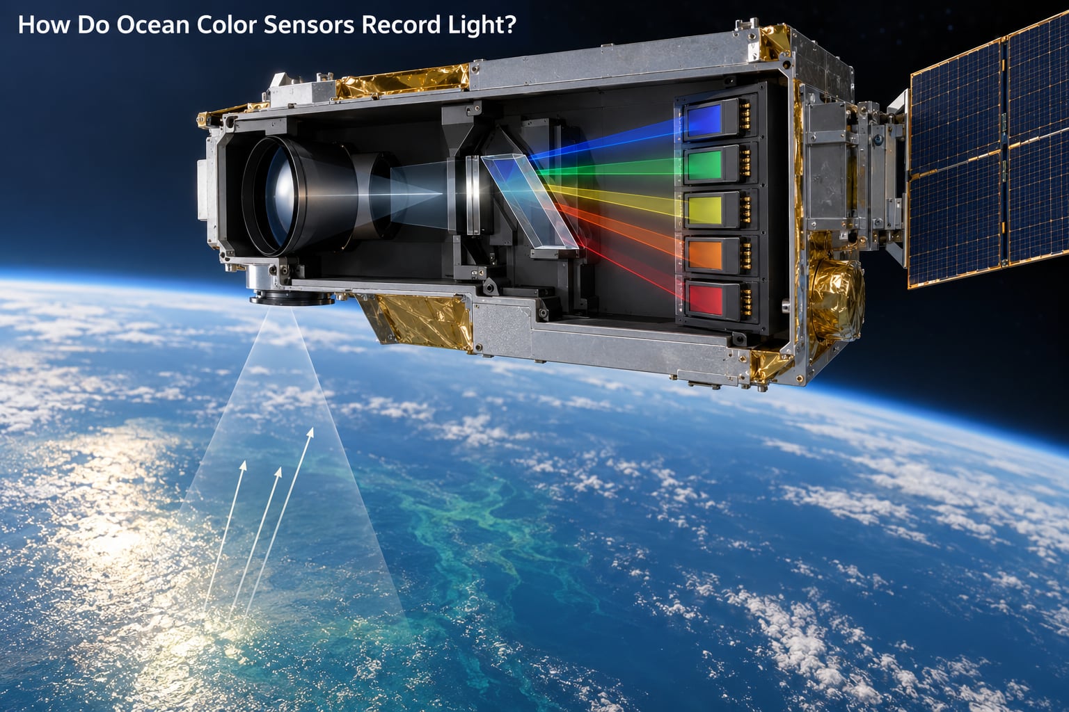
Ocean color instruments are radiometers built for a hard signal-to-noise ratio. The water-leaving radiance is small, the atmosphere in front of it is bright, and the required spectral sampling is fine. That combination drives the design.
A cross-band scanner like MODIS has a rotating mirror that views the Earth-facing field of view in bands as the satellite flies its orbital track, giving a swath of a couple thousand kilometres. A push-broom sensor like Sentinel-3 OLCI has no moving scan mirror; it uses a fixed telescope with a slit across-track and a detector array that sweeps the swath line by line as the platform moves.
Four resolution numbers describe any ocean color sensor, and confusing them is the most common source of bad expectations.
- Spectral resolution — band width in nanometres. Broad bands average over detail; narrow bands resolve chlorophyll fluorescence lines but carry fewer photons each, which hurts signal-to-noise.
- Spatial resolution — the ground sample distance. Roughly 300 to 1000 m at the sensor for the mainstream missions, binned to 4 to 9 km for many global products.
- Temporal resolution — revisit. Daily coverage from LEO polar orbits, less from geostationary imagers with their own viewing-geometry trade-offs.
- Radiometric resolution — signal-to-noise ratio in the blue bands, which is where the water signal is weakest.
The table below compares the missions that defined the field. Treat status as of 2026 and check the archive for the current operational status of any individual mission.
| Mission | Launch | Ocean color bands | Native resolution | Revisit | Status |
|---|---|---|---|---|---|
| CZCS | 1978, data from 1987 | 6 visible | 825 m | Once every 16-18 days at a given point | Historic baseline record |
| SeaWiFS | 1997 | 8 visible | 1.1 km | Daily | Ended; the long chlorophyll record still references it |
| MODIS, Terra and Aqua | 1999 and 2002 | 9 ocean bands | 250-500 m bands, 1.25 km bands | Daily | Long-running operational record |
| VIIRS, Suomi NPP and NOAA-20 | 2011 and 2017 | Ocean colour bands plus SWIR | 750 m bands | Daily | Operational successor to MODIS |
| Sentinel-3 OLCI | 2016 | 21 visible at 5 nm plus SWIR | 300 m | Daily with twin satellites | Operational, ESA and Copernicus |
| PACE OCI | 2024 | About 90 visible at high spectral resolution | 1.2 km bands | Daily | Hyperspectral operational mission |
Those are representative characteristics rather than a promise of service. Mission lifetime, calibration state and product version all change, so read the sensor’s data quality statement before you build a processing chain on top of it.
Why Does the Atmosphere Make Satellite Ocean Color Data Difficult?
Over a clear ocean, the overwhelming majority of the light a satellite receives was never in the water. Rayleigh scattering by air molecules redirects short wavelengths across the whole upward hemisphere, and aerosols add a variable whitish veil on top.
That contribution grows with solar elevation and with atmospheric turbidity, and it shifts with aerosol type. An algorithm tuned on a pristine subtropical atmosphere will overestimate water-leaving radiance under Saharan dust by a wide margin. Some absorbing gases, notably ozone in the Chappuis band and nitrogen dioxide in the blue, add further wavelength-dependent error.
Three more effects complicate the picture. Sun glint is specular reflection off a flat sea surface, and a rough sea spreads it into a bright haze centred near the specular point. Adjacency effects occur when very bright clouds or sun glint contaminate nearby water pixels through the instrument’s stray-light and spatial response. Thick cloud simply blocks the view, and it does that to roughly a fifth to a third of the ocean on any given pass.
How Are Atmospheric and Sensor Effects Removed?
Atmospheric correction is the pivotal step of the whole chain. Over open ocean, where the water itself is nearly black in the near-infrared, the common approach estimates the atmosphere from the near-infrared signal and assumes the water leaves none of that light behind, then scales the correction into the visible.
That assumption breaks in coastal and turbid water, where near-infrared light does return from the water. Complex atmospheric correction algorithms, such as the family used for MODIS and VIIRS, use several near-infrared and short-wave-infrared bands together with an iterative step to estimate both the aerosol contribution and the water-leaving portion at once.
Around the correction sit the quality controls. Each pixel gets tested for cloud, glint, adjacency, stray light, atmospheric gas absorption and polarisation effects, and any failure sets a bit in a per-pixel quality flag.
| Error source | How it is handled | What remains |
|---|---|---|
| Rayleigh and molecular scattering | Modelled from geometry and pressure, using bands at several wavelengths | Residual error grows with high aerosol load |
| Aerosols | Estimated from near-infrared and SWIR bands, assuming the water is black there, or from multi-angle observations where available | Large errors where the water is not black in the near-infrared |
| Clouds and shadows | Pixel classification using brightness, spectral tests and neighbouring pixels | Thin cirrus and cloud edges are the usual misses |
| Sun glint | Masked by geometry: the glint angle relative to the specular direction drives the flag | Residual glint in rough seas near the specular direction |
| Adjacency and stray light | Neighbour-pixel searches, instrument stray-light correction applied after the fact | Contamination close to clouds and bright ships |
| Absorbing gases | Band-specific absorption coefficients for ozone and nitrogen dioxide | Unmodelled variability in aerosol-gas interactions |
| Polarisation | Instrument design plus a polarisation correction using a dedicated band | Small residual at extreme viewing angles |
A product where a large share of pixels carry a quality flag of anything other than “good” tells you the correction struggled. Read the flags before you read the values.
How Does Corrected Light Become a Scientific Product?
This is an inverse problem. The satellite measures a spectrum and infers the water properties that could have produced it. Multiple combinations of absorption and scattering can look identical, so the inversion is not unique and has to be constrained by an assumed model of the water.
Empirical algorithms are the workhorses. Band-ratio and band-difference approaches compare reflectance in two or more bands, exploiting the fact that chlorophyll absorption changes the shape of the spectrum in a predictable way. The OC3 family used with MODIS and VIIRS, the Carder formulation for MODIS chlorophyll, and the Garrels, Gordon and Moore model are all examples, differing mainly in which bands they use and how the relation behaves at low concentrations.
More physically based approaches model the water explicitly from inherent optical properties — how strongly water, pigments and particles absorb and scatter at each wavelength — and invert that model. It costs more computation and needs more assumptions, but it degrades more gracefully in water the empirical case was never tuned for.
That distinction is what separates Case 1 waters, open ocean dominated by phytoplankton, from Case 2 waters, coastal and turbid water where sediment and coloured organic matter dominate. Case 2 retrievals routinely miss by a factor of two or more, which is why most optical water type classification exists — to tell the user when not to trust the number.
What Do Different Ocean Color Bands Reveal?
Band choice follows the physics of absorption. The table below maps the main wavelength regions to what each is used for; exact band centres vary by sensor, so match them to the band definition in the data file rather than assuming a fixed wavelength.
| Band region | Typical use | Why |
|---|---|---|
| Blue, roughly 400-500 nm | Chlorophyll-a, CDOM, atmospheric correction | Scattering by water and particles is low, so the signal is sensitive but faint; CDOM absorption is strongest here |
| Green, roughly 500-570 nm | Chlorophyll-a in turbid water, phycocyanin, water-leaving radiance itself | Chlorophyll fluorescence and phycocyanin absorption lines sit here |
| Red, roughly 620-670 nm | Chlorophyll fluorescence, total suspended matter, turbidity | Chlorophyll fluorescence peaks near 685 nm; suspended particles backscatter strongly |
| Near-infrared, 700-900 nm | Atmospheric correction, turbid water retrieval | Pure water absorbs almost everything, so any signal here is mostly atmosphere |
| Short-wave infrared, 1.2-2.4 µm | Cloud and aerosol discrimination | Water absorbs completely, so any reflectance means cloud, ice or aerosol |
Hyperspectral sensors push this further, sampling the visible spectrum densely enough to catch the narrow fluorescence and absorption features that broadband bands blur out. That is the main argument for missions like PACE OCI.
How Is the Data Processed into Time Series and Maps?
From a raw file to a usable map, the sequence is: geolocation, where pixel coordinates come from the spacecraft ephemeris, attitude and land masks; radiometric calibration, to convert counts to radiance; atmospheric correction, to remote sensing reflectance; algorithm application, to get the environmental variable; binning, to average high-resolution pixels into 1.2 km or coarser grids; and quality flagging at every step.
The processing levels describe how much has been done to the data, and this is the terminology that trips people up most.
| Level | What you get | Typical user |
|---|---|---|
| L1A | Raw counts with full instrument metadata and calibration coefficients attached | Anyone reprocessing the record themselves |
| L1B | Calibrated at-sensor radiance, geolocated, with coarse quality flags | People building their own correction |
| L2 | Per-pixel geophysical variable with remote sensing reflectance and quality flags, still in swath geometry | Researchers working on a specific event or region |
| L3 | Binned and mapped into a regular grid, usually daily, weekly, monthly or seasonal composites with maps and a time series | Most users, and anyone building a map |
| L4 | Model-derived fields such as ocean mixed layer depth or net primary production, blended from multiple inputs | Biogeochemical modellers |
That distinction matters in practice. A Level 2 file lets you apply your own algorithm or your own masking decisions to a specific location and date. A Level 3 composite has already averaged, masked and interpolated, so daily coverage is complete but individual storms, fronts and bloom edges have been smoothed away.
For a time series, composites get further aggregated into weekly, monthly, annual and decadal records. These multi-year climate data records are what make trend analysis possible, and they require consistency of calibration and algorithm across decades, not just across one mission.
How Accurate Is Satellite Ocean Color Data?
Accuracy depends entirely on what you compare against and where. Open-ocean chlorophyll retrievals from a well-calibrated sensor are good enough for basin-scale phenology. The same algorithm on a turbid estuary can be wrong by a factor of two in either direction, and near a bright sand bar or over a kelp bed the pixel may contain no meaningful water signal at all.
The failure modes are well mapped.
| Where errors matter most | Cause | Practical consequence |
|---|---|---|
| Coastal and estuarine water | Suspended sediment and CDOM break the assumptions behind the atmospheric correction and the algorithm | Large positive bias in chlorophyll, unreliable water-leaving reflectance |
| Shallow shelf and reef | Bottom reflection enters the water-leaving signal | False low chlorophyll, false turbidity, but useful for shallow bathymetry |
| Cloudy and high-latitude waters | Persistent cloud and low sun angles cut the valid observation count | Long gaps in time series, poor composite quality |
| Sunglint and adjacency | Specular reflection and stray light contaminate neighbouring pixels | Spurious bloom-like features in otherwise uniform fields |
| Mixed pixels and edge cases | One pixel covering water, cloud and coastline | Product failure at fronts and near coastlines |
| Long time series | Calibration drift and algorithm version changes | Apparent trend that is really an instrument artefact |
Two distinctions keep this honest. A single pixel can be wrong while a regional or global mean is unbiased, so evaluate accuracy at the scale you intend to use. And pixel-level error bars say nothing about the systematic biases that are common to every pixel in a run.
How Do Scientists Validate Satellite Measurements?
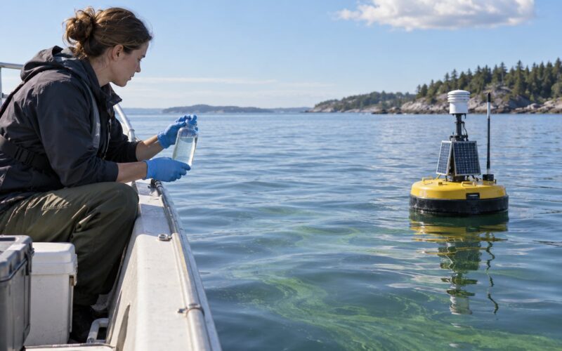
Nobody takes a satellite retrieval at face value. Every operational product is validated against independent in-water measurements, and that comparison is a deliberate scientific activity with its own standards.
A match-up means a satellite acquisition and an in-water measurement of the same pixel, close enough in space and time to be considered equivalent. The strictness matters: a radiometer profile collected hours or days away from overpass is not a match-up, and treating it as one quietly inflates reported accuracy.
The instruments come from a mix of platforms.
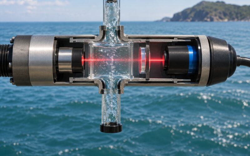
| Satellite ocean color | In-water radiometer | |
|---|---|---|
| What it measures | Water-leaving radiance integrated over the top few metres, via at-sensor radiance | Radiance and reflectance at specific depths, matched to satellite geometry |
| Scale | Thousands of square kilometres per pixel | A single point or vertical profile |
| Coverage | Global, synoptic, repeat visits | One location, one time, one operator |
| Bias sources | Atmospheric correction, adjacency, algorithm assumptions | Stray light, instrument self-contamination, surface bubble layer, imperfect geometry matching |
| What only it catches | Basin-wide bloom extent, fronts, decadal trends | Depth structure, vertical particle profiles, species-level pigment detail |
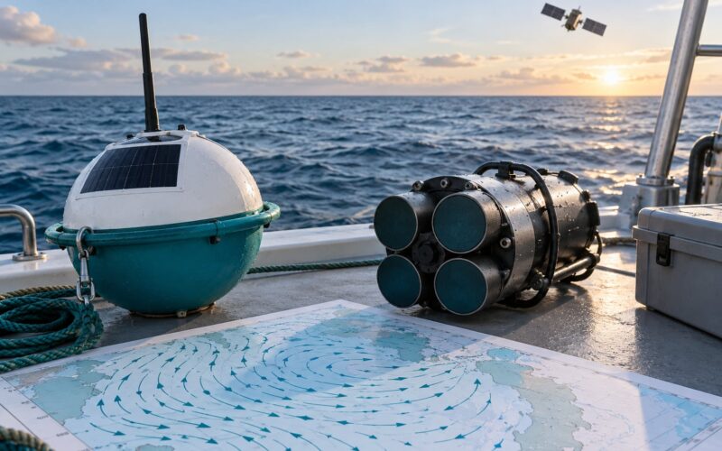
Standard reference instruments such as DALEC and SeaPRISM are designed with matched spectral response and a well-characterised field of view for exactly this purpose. Fixed networks such as AERONET-OC provide long-term radiometric reference data for atmosphere correction, and independent platforms such as drifting buoys, moored radiometers and autonomous surface vehicles fill in the temporal and spatial gaps the satellite cannot.
For a robotics developer this is the practical point: a small, well-characterised radiometer carried on your own platform is not a consolation prize. It is how you tell whether the satellite you are using to plan a mission is actually right about the water you are about to enter.
How Is Ocean Color Data Used in Marine Research and Technology?
Applications break into a handful of families, and each leans on a different part of the retrieval.
- Phytoplankton and primary production. Chlorophyll-a maps over basin scales give the timing and magnitude of the spring bloom, which is the single largest biological event on the planet.
- Harmful algal bloom tracking. Optical water types, chlorophyll and turbidity together flag blooms that close shellfish beds, and the daily revisit is what makes it operationally useful.
- Sediment and water clarity. Total suspended matter maps track erosion, resuspension and river plumes, and feed coastal erosion and sediment transport models.
- Habitat mapping. Water-leaving reflectance separates shallow reef, seagrass and macroalgae beds, and shallow-water bathymetry can be derived where the bottom signal is detectable.
- Ecosystem and carbon models. Satellite chlorophyll, combined with photosynthetically active radiation, gives primary production estimates that anchor biogeochemical model behaviour.
- Long-term climate records. Multi-decade chlorophyll and sea surface temperature records are how ocean productivity trends, and their uncertainties, get quantified.
For marine robotics, the pattern is mission planning and adaptive sampling. An autonomous surface vehicle can download a Level 3 map, spot a bloom front or a sediment plume it is heading toward, and re-route to sample it. A turbidity or fluorescence sensor on the hull then supplies the high-resolution detail the satellite pixel never could.
Satellite products complement field measurement; they do not replace it. The pixel is a metres-scale average over the top of the water column, and interpreting it properly means knowing what was in it.
Frequently Asked Questions
What causes the different colors of the ocean?
Water itself does most of it. Pure seawater absorbs red and yellow wavelengths strongly while scattering shorter blue wavelengths back out, so deep clear water looks blue. Add phytoplankton, and chlorophyll-a absorbs blue and red and scatters green, turning productive water greenish. Sediment and coloured dissolved organic matter make coastal water brown or tan, and shallow sand or mud can make it look bright.
Why can’t satellites see ocean color through clouds?
Cloud droplets and ice crystals scatter and absorb the same visible light the sensor relies on, and a thick cloud blocks the ocean surface entirely. Cloud covers roughly a fifth to a third of the ocean on a typical pass, which is why daily Level 3 composites exist and why cloudy regions have long gaps. Thin cirrus is harder still, since it can pass brightness tests while still corrupting the water-leaving signal.
Does satellite ocean color data directly measure marine pollution?
Not directly. The sensor measures light, not chemicals, so any pollutant result is an inference from how a substance absorbs or scatters light. Oil and surfactants do produce surface slicks with distinctive reflectance signatures, and turbidity from river sediment or runoff is a well-established proxy for land-based input. Dissolved nutrients and persistent organic pollutants are not observed directly and require a model or a linked field measurement.
What spatial resolution does satellite ocean color imagery provide?
Native band resolution is around 300 to 1000 metres for the mainstream missions: Sentinel-3 OLCI at about 300 metres, VIIRS ocean colour bands at about 750 metres, MODIS at 250 to 500 metres for its shortest bands. Many global products are binned to 4 to 9 kilometres, and binned products are unsuitable for coastal and estuarine work. Near-infrared band resolution is typically coarser than the shortest visible bands.
Which satellite ocean color data source should researchers use?
Pick by variable, region and scale rather than by mission name. For an open-ocean chlorophyll time series, MODIS or VIIRS Level 3 composites through the NASA Ocean Color Web or OB.DAAC give the longest continuous records. For regional and coastal work, Sentinel-3 OLCI gives finer native resolution and hyperspectral capability, though the retrieval algorithms still struggle in turbid water. Always read the product quality flags and the per-pixel flags before interpreting a value.
Conclusion: Start with a Quality-Checked Product
The workflow in one line: sunlight in, water-leaving radiance out, atmosphere subtracted, variables retrieved, quality flagged.
Before you interpret a single pixel, do four things. First, name the variable you actually need, since chlorophyll, sediment and CDOM come from different parts of the spectrum and have different failure modes. Second, choose the mission and product level that suit the scale, using Level 2 if you need your own masking and a Level 3 composite if you need complete coverage. Third, inspect the per-pixel quality flags and the acquisition geometry, including solar elevation and viewing angle. Fourth, validate against field or model data before the number goes anywhere near a conclusion.
Done in that order, satellite ocean color data is one of the few global views we have of what is happening in the top few metres of the ocean, and it is trustworthy within limits that are documented rather than assumed.