To plot sensor data on a map, load a log where every row carries a timestamp, a latitude, a longitude and a measurement, then hand the coordinates to a mapping library like folium or GeoPandas and colour the markers by the reading. Most first-timers get stuck before any code runs, usually on a swapped latitude and longitude column, so the clean-up step matters more than the library choice.
This guide covers the whole path for marine robots, drifters, buoys and any field deployment: what the data must look like, which tool fits the job, how to get the track and the readings onto one map, and how to export something you can drop into a report. It is written for 2026 and the current versions of the tools listed below.
Table of Contents
- What You Need Before You Plot Sensor Data on a Map
- Step-by-Step: How to Plot Sensor Data on a Map
- Common Mistakes That Wreck Sensor Maps
- Frequently Asked Questions
- Can I plot sensor data on a map without coding?
- What file format should marine sensor data use?
- How do I fix GPS points that appear in the wrong location?
- Should I use GPS coordinates in decimal degrees or another format?
- How can I show temperature or salinity measurements on a marine map?
- Can I plot sensor data offline while a robot is at sea?
- Conclusion
What You Need Before You Plot Sensor Data on a Map
You need three things: a coordinate-tagged data file, a mapping library, and a decision about how many points you actually have. That last one decides whether you need markers at all.
The data file. A CSV with one row per reading works everywhere and stays readable in a spreadsheet. Your columns should look like this:
timestamp,station_id,lat,lon,water_temp_c,salinity_psu,battery_v
2026-05-14T08:12:03Z,BUOY-01,37.8204,-122.4813,14.6,33.9,12.7
2026-05-14T08:12:33Z,BUOY-01,37.8206,-122.4809,14.6,33.9,12.7
Keep raw sensor units in the column names, the way the example does. A file where one column is called temp and the next is called temp_c is a file that will bite you later.
The software. Python 3 with pandas is the floor. Everything else depends on the output you want:
pip install pandas folium          # interactive web maps, the easiest start
pip install geopandas matplotlib    # static maps for reports
pip install geopandas cartopy       # static maps with real cartographic projection
pip install plotly pyserial         # time slider plus live serial feeds
Two notes on the ecosystem. Matplotlib’s old Basemap library is deprecated and no longer maintained, so use Cartopy instead of hunting for old install fixes. And GeoPandas pulls in a stack of compiled dependencies, which is why people hit installation errors; installing the conda-forge geopandas package usually saves an afternoon on Windows and Apple Silicon. That has been my own experience more than once.
Optional for live work. A Raspberry Pi or ESP32 onboard the robot, a GPS module that speaks NMEA 0183, and pyserial to read the feed. You also want a basemap you can load without internet, which we cover in Step 3.
Preparation. Before plotting anything, check your row count and your date range. Ten thousand rows is comfortable in a marker map. A million rows is not, and no amount of clever code will make a browser draw a million markers smoothly.
Step-by-Step: How to Plot Sensor Data on a Map
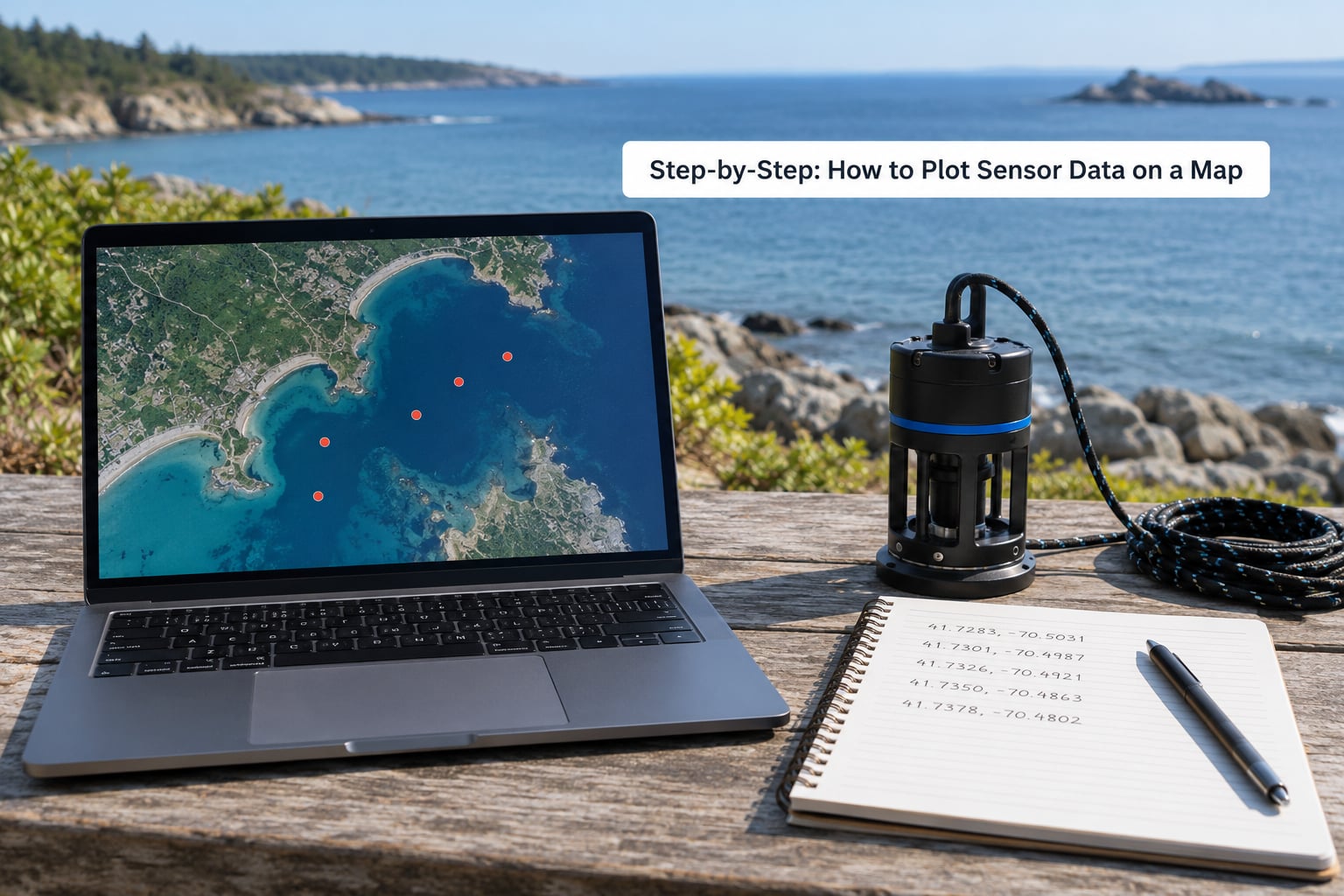
Step 1: Prepare and Check Your Sensor Data
Every reading needs four things to be plottable: a time, a position, a value, and a unit. Missing any one of them and the map either drops the row or lies about it.
Load the file and look at the ranges before drawing anything:
import pandas as pd

df = pd.read_csv("buoy_log.csv", parse_dates=["timestamp"])
print(df.describe())
print("rows:", len(df), "gaps:", df["timestamp"].diff().max())
print("nulls:n", df.isna().sum())
The describe output tells you three useful things. If your latitude column has a max near 90, you have probably got longitude and latitude swapped, or a stray value typed into the wrong row. If the temperature column reports a minimum of -273, you have a sentinel value like -999 standing in for “no reading”, and you should mask it rather than plot it.
Then check for gaps. A maximum interval far larger than your logging period means the vehicle dropped out or the receiver lost signal, and the straight line drawn between those two points is fiction. Mark those segments instead of hiding them.
For GPS noise specifically, a cheap GPS module sitting on a bobbing hull will wander tens of metres while stationary. Plot the raw points once, zoom in, and see how much they move. If the spread is bigger than the feature you care about, apply a rolling median to latitude and longitude, or a simple dead-reckoning filter, before you add any colour.
Step 2: Choose the Right Mapping Tool
Pick the output you need first, then the library. A map that will live in a report needs a static image, while a map you will click around needs to be interactive, and those two rarely share the same tool.
| Tool | Output | Best for | Watch out for |
|---|---|---|---|
| folium | Interactive HTML | Fastest route from CSV to a shareable map; popups, heat maps, marker clustering | No native live update; you rebuild the file |
| GeoPandas + Matplotlib | Static image | Plotting points, tracks and polygons together with zorder control | No basemap unless you add contextily |
| Cartopy | Static image | Publication figures with correct projection, coastlines and graticules | Steeper learning curve |
| Plotly | Interactive HTML | Time slider playback, hover readouts, several sensor channels at once | Large point sets load slowly |
| QGIS | Interactive desktop | No code, hand-inspect coordinates, styled layers, print layouts | Not scriptable for repeated runs |
For most marine field teams the pairing is simple: folium while you are exploring the data, then Cartopy or QGIS for the figure that goes in the report. Bokeh and Leaflet.js are worth knowing about if your dashboard already lives in JavaScript, but you rarely need them just to plot a survey.
Step 3: Load the Data and Define the Coordinate System
Define the coordinate reference system before you draw, because almost every wrong-location bug traces back to it. GPS and most marine logs are geographic coordinates in EPSG:4326, which is latitude and longitude in decimal degrees. Web tile maps are displayed in EPSG:3857, Web Mercator, and most libraries convert for you when you hand them plain lat and lon pairs.
So for folium you pass the raw values and let it handle the rest:
import folium

centre = [df["lat"].mean(), df["lon"].mean()]
m = folium.Map(location=centre, zoom_start=11, tiles="OpenStreetMap")
m.fit_bounds([[df["lat"].min(), df["lon"].min()],
              [df["lat"].max(), df["lon"].max()]])
How do you know it worked? fit_bounds centres the map on your data and zooms so the whole survey fills the view. If your points are somewhere in the ocean off Somalia, the coordinates are almost certainly reversed.
For offline work, tile layers are the part people forget. OpenStreetMap’s standard tiles need a connection every time the map pans. Download a tile package or a regional extract for your survey area before you leave the dock, or use a vector coastline dataset so the basemap travels with the file. Worth checking the tile provider’s usage policy for anything automated or heavy.
For static maps in GeoPandas, the CRS matters at the point of creation and again at the point of drawing:
import geopandas as gpd
from shapely.geometry import Point

gdf = gpd.GeoDataFrame(
    df,
    geometry=gpd.points_from_xy(df["lon"], df["lat"]),  # lon FIRST, lat second
    crs="EPSG:4326",
)
print(gdf.crs)
points_from_xy takes x then y, and x is longitude. That single argument order explains most of the “my markers are in the wrong ocean” posts.
Step 4: Plot Sensor Data on a Map With Markers, Tracks and Popups
Draw the track first, then the readings on top, so the readings stay visible. A polyline takes the coordinate list in order:
m.add_polyline(
    folium.PolyLine(list(zip(df["lat"], df["lon"])), weight=2, opacity=0.6)
    .add_to(m)
)
For individual readings, a popup is worth more than any styling. Put the time and the measurement in it and your map answers questions without a legend:
for _, row in df.iterrows():
    folium.CircleMarker(
        location=[row["lat"], row["lon"]],
        radius=5,
        popup=f"{row['timestamp']:%H:%M:%S} UTC<br>"
              f"{row['water_temp_c']} C<br>"
              f"{row['salinity_psu']} PSU",
    ).add_to(m)

m.save("survey.html")
If you have thousands of points, one circle per reading will choke the browser. MarkerCluster groups overlapping markers into a single bubble that splits as you zoom in:
from folium.plugins import MarkerCluster

cluster = MarkerCluster().add_to(m)
for _, row in df.iterrows():
    folium.Marker([row["lat"], row["lon"]],
                  popup=f"{row['water_temp_c']} C").add_to(cluster)
Streaming live readings into the map is the question that comes up most often, and the honest answer is that folium is not built for it. It writes an HTML file and stops. The workable pattern is to read NMEA sentences from the serial port with pyserial, append each fix to a list, and rewrite the map file on a timer while a browser reloads it, or serve the current position as GeoJSON and refresh it with a small Leaflet layer. That is good enough for monitoring a surface vehicle from the dock.
If you need smooth continuous playback rather than a refreshing marker, Plotly’s time slider is the better fit. You build one figure with a frame per minute or per hour and the reader scrubs through the survey.
Step 5: Add Color Scales, Legends and Basemaps
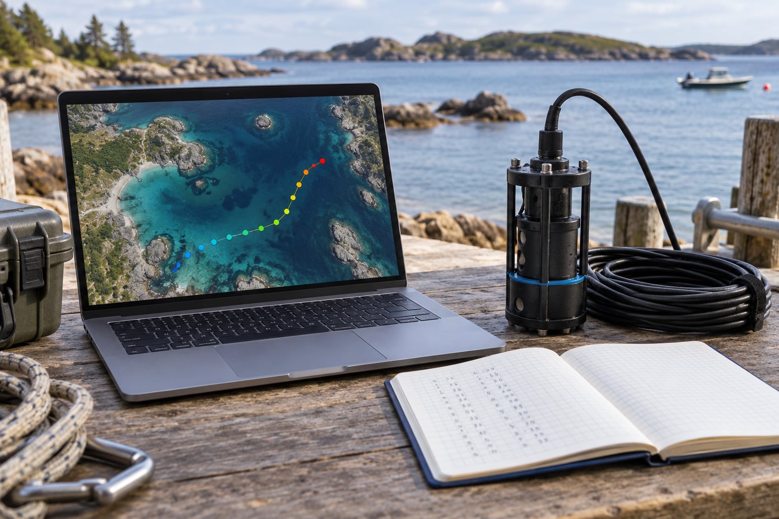
This is the step that turns a pile of dots into sensor data. The measurement should drive the colour, and the colour needs a legend with units attached.
import matplotlib.cm as cm
import matplotlib.colors as mcolors

vals = df["water_temp_c"]
norm = mcolors.Normalize(vmin=vals.min(), vmax=vals.max())
cmap = cm.coolwarm

for _, row in df.iterrows():
    folium.CircleMarker(
        location=[row["lat"], row["lon"]],
        radius=6,
        fill_color=cmap(norm(row["water_temp_c"])),
        color="black", weight=1,
    ).add_to(m)
A sequential colormap like coolwarm, viridis or plasma suits temperature, salinity, pH or turbidity, because those readings move along a single scale. Reserved, categorical colours suit a variable with distinct states, such as a pass or fail threshold or a sensor health flag.
Then write the legend where someone else will read it. Include the variable name, the units, the colour range and the survey dates in the title block, not just the map:
title = ("Bay transect survey - surface water temperature<br>"
         "14 to 20 May 2026 - degrees Celsius - BUOY-01")
folium.Element(
    f'<h3 style="padding:8px">{title}</h3>'
).add_to(m)
Two rules keep a colour map honest. Keep the colour range fixed across all the maps in a report, otherwise two figures with different legends cannot be compared. And start the ramp at the meaningful value rather than the data minimum, so a 0.2 C drift reads as a drift rather than a full gradient.
For basemaps, OpenStreetMap is the neutral default, a light grey style such as CartoDB positron keeps your colour-coded markers readable on top, and OpenTopoMap adds useful detail when you are near shore. Whichever you pick, put it underneath with Folium’s LayerControl so the reader can turn it off.
If the data is dense rather than sparse, stop plotting individual markers and switch to a heat map, where point density becomes the colour. This is also the fix for oversized files: a million raw GPS points can produce an unusable image and a file in the gigabytes, while the same data rendered as a heat map stays small and responsive.
from folium.plugins import HeatMap

m.add_child(HeatMap(
    list(zip(df["lat"], df["lon"], df["water_temp_c"])),
    radius=12, blur=18, max_val=30,
))
Step 6: Validate and Export the Finished Map
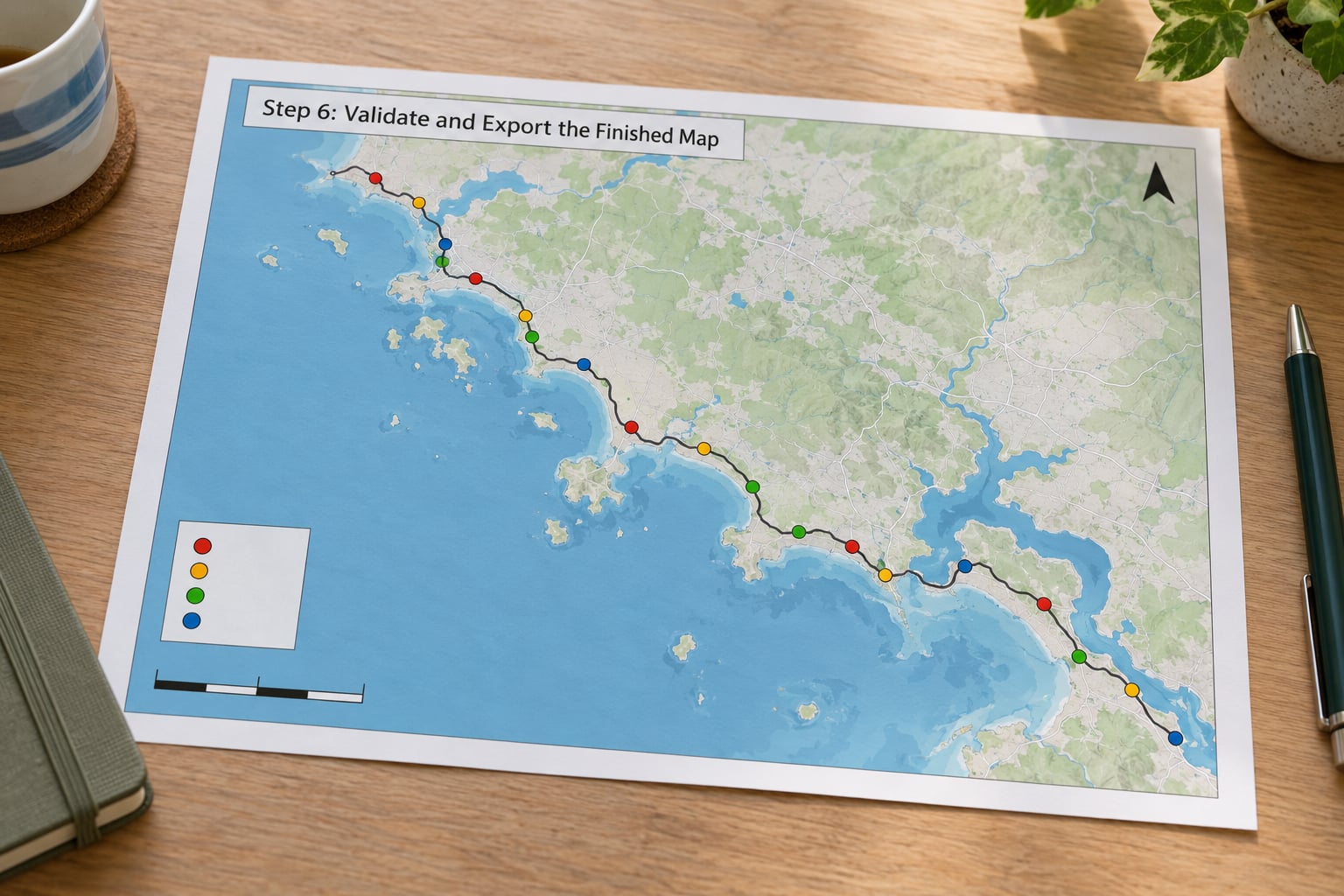
Run these checks before anyone else sees the map. Zoom in on one transect and confirm the points sit on the path the vehicle actually took. Read three popups and compare them against the raw CSV, because a stray unit conversion shows up here first. Check that timestamps are in the zone you think they are, and that a log spanning an afternoon has not quietly lost an hour to a timezone offset.
Then look at the colour scale with fresh eyes. A ramp that runs light to dark over a two-degree range implies far more change than actually happened, and a legend with no units invites someone to guess.
On export, choose by destination. Save standalone HTML with m.save("survey.html") for sharing; it is a single file with no server needed. For a report, save a static PNG at a dpi high enough for print. For anything that will be revisited or combined with other layers, export the GeoDataFrame as GeoJSON so the geometry and attributes travel together.
Whatever you ship, put the date range, the source file and the tool version in the corner. Sensor maps get photocopied, pasted into slide decks and re-used a year later by someone who was not there.
Common Mistakes That Wreck Sensor Maps
Swapped latitude and longitude is the most common failure. Every marker lands in an implausible place and the map looks broken rather than wrong. The fix is a range check before plotting: latitude must fall between -90 and 90, longitude between -180 and 180, and if your coastal survey is near zero degrees east, a longitude column full of 37s is your answer.
Mixing coordinate formats causes the same symptom. Some loggers write degrees and minutes, some write decimal degrees, and some NMEA parsers hand you degrees, minutes and seconds as separate fields. Confirm which one you have, convert once at import, and write the unit into the column name.
Bad GPS fixes add points on land while the robot is at sea, or a cluster of markers at exactly zero coordinates, which usually means the receiver never locked. Filter on quality indicators where your logger provides them, and drop rows where latitude and longitude are both zero.
Unlabelled units make a colour map useless. A gradient from 14 to 16 could be degrees Celsius, or could be salinity in PSU, and the reader cannot tell which.
Timezone confusion quietly reorders your data. Log UTC everywhere and convert only at the point of display. A log where the receiver stamps local time and the notebook stamps UTC will interleave readings from two different hours.
A default colour scale exaggerates small differences. State the range you are using, and keep it consistent between figures.
Overplotting hides the signal. Ten thousand overlapping opaque circles tell you only that you were there. Cluster, thin, or switch to a heat map.
Finally, ignore the tutorials still teaching Basemap. It is deprecated, unmaintained, and the reason a lot of people believe geospatial Python is painful.
Frequently Asked Questions
Can I plot sensor data on a map without coding?
Yes. QGIS is the strongest option here: import your CSV as a delimited text layer, set X as longitude and Y as latitude, assign EPSG:4326, then style the layer by graduated colour using the sensor column. You also get a print layout with a legend and scale bar, which is handy for report figures. Online spreadsheet tools work for a quick shared view, but they cap at a few thousand rows.
What file format should marine sensor data use?
CSV is the safest default: one header row, one row per reading, ISO 8601 UTC timestamps, decimal degrees, and units written into the column names. GeoJSON is better when you also need the track as a LineString or when a browser will consume it directly. Parquet or SQLite suit surveys large enough that reading a CSV takes minutes, and SQLite is a good sink for data arriving live from an onboard logger.
How do I fix GPS points that appear in the wrong location?
Check latitude and longitude order first, since reversed columns are the usual cause. Then confirm the coordinate reference system is EPSG:4326 and that the values are decimal degrees rather than degrees and minutes. Look for rows where both coordinates are zero, which mean the receiver never locked, and drop them. A cluster of points on land during a marine survey usually indicates a bad antenna fix rather than a data bug.
Should I use GPS coordinates in decimal degrees or another format?
Use decimal degrees for everything. NMEA sentences arrive in degrees, minutes and seconds, and most libraries expect decimal degrees, so convert once at import with a helper such as gpsd.to_dec or your own function. Store the converted value in its own column and write decimal_degrees in the name so nobody has to guess later.
How can I show temperature or salinity measurements on a marine map?
Colour each marker with a value from the sensor column using a sequential colormap such as coolwarm, viridis or plasma, then add a legend carrying the variable name, its units and the colour range. Keep the range fixed across every map in the same report so figures remain comparable. For dense transects where markers overlap, switch to a heat map, where the reading itself supplies the colour and density carries the shape.
Can I plot sensor data offline while a robot is at sea?
Yes, with preparation. folium and Plotly generate self-contained HTML files, so the map itself works without a connection, but the basemap tiles do not unless you download them for your survey area or use a vector coastline dataset. Cartopy and GeoPandas draw coastlines from bundled data with no internet at all. Build the map on shore, copy it to the onboard computer, and refresh it from a local logger.
Conclusion
Start by cleaning and verifying three columns: timestamp, coordinates, and the sensor value with its unit. Check the ranges, drop rows where the receiver never locked, and confirm latitude and longitude are not reversed, because no library will save a map built on swapped columns.
Then pick folium for an interactive view and Cartopy or QGIS for the figure that goes in the report. Plot a small test dataset first, confirm the points fall where the vehicle went, and only then scale up to the full survey. Colour by the measurement, label the legend with units, and export.