To use QGIS for marine data, you load oceanographic files such as NetCDF grids, multibeam soundings, GPS tracks and shapefiles into the QGIS 3.x desktop app, confirm the coordinate reference system, then style, analyse and export them. The whole workflow takes about an afternoon for a first project, and nothing in it costs money.
Most marine data is free and then useless on its own. A CSV of depth readings is just numbers until it sits on a coastline, and a NetCDF file of sea surface temperature is a multi-gigabyte cube until you know which slice to render. QGIS is the bridge between the two, and it reads the awkward formats through GDAL without conversion gymnastics.
This guide walks the full chain: import, coordinate reference system, cleaning, symbology, spatial analysis, and a finished map you can print or hand to a skipper. Everything below uses the QGIS 3.x desktop interface, and the menu paths are current for the 3.34 and later releases.
Table of Contents
What You Need
You need three things: the software, the data, and a rough idea of how your data was recorded. The third one is the part people skip, and it is what decides whether the rest works.
The software
Download QGIS from the official site and pick the LTR (long-term release) build for stable plugin support. The standalone installer bundles GDAL, GRASS and SAGA, so you get the whole Processing toolbox without hunting for extra packages. QGIS is released under the GNU General Public Licence, runs on Windows, macOS and Linux, and costs nothing. You do not need a paid licence for anything in this guide.
The data formats you will meet
| Format | What it holds | How to open it in QGIS 3.x | Reach for it when |
|---|---|---|---|
| NetCDF (.nc) | Model and observation grids with time and depth dimensions | Layer, Add Layer, Add Raster Layer; pick the variable from the band list | You have a Copernicus-style product or any gridded ocean forecast |
| GeoTIFF (.tif) | Single georeferenced raster, often a bathymetry surface or backscatter mosaic | Layer, Add Layer, Add Raster Layer | You already have a single processed surface |
| GeoPackage (.gpkg) | Vector features plus rasters, in one SQLite container | Layer, Add Layer, Add Vector Layer | You want one editable file for a whole survey |
| Shapefile (.shp) | Points, lines and polygons with attribute tables | Layer, Add Layer, Add Vector Layer | Interoperability with other agencies’ shapefiles |
| CSV with XYZ columns | Soundings, station positions, sensor readings | Layer, Add Layer, Add Delimited Text Layer; set X and Y fields | Your own echosounder or USV output |
| GPX and KML | GPS tracks and waypoints | Layer, Add Layer, Add Vector Layer, then the GPX or KML filter | Vessel tracks, AUV dives, planned survey lines |
| WMTS and WMS tiles | Live basemap and chart services | Layer, Add Layer, Add XYZ Tiles or Add WMS Layer | Context under your own data without a download |
Two formats sit outside this table on purpose. S-57 and its S-100 successor are the standards for electronic navigational charts, and they open as vector layers with chart-style symbology, but producing anything chart-grade from them is a cartography project of its own rather than a workflow step. NetCDF2QGIS is a third-party plugin, not a format, and it turns a multi-variable NetCDF cube into one layer per variable with time as an attribute field, which some people find friendlier than the native band list.
The field information to have ready
Before you import anything, write down three details for each dataset: the EPSG code or CRS name, the units the depth or distance values are recorded in, and the datum. Sonar software exports metres below the transducer, and layer stacks often expect elevation above a geoid, so a constant offset between the two is a common source of a seabed sitting implausibly high or low. If the data came from a log, the header usually states the projection; if it came from a colleague, ask rather than guess.
A tidy folder structure
Put raw downloads in a read-only folder, working files in a second, and exports in a third. QGIS projects save relative paths by default in recent 3.x releases, which means a project folder that moves as a unit keeps working, and a project folder that gets reorganised in place quietly loses its layers.
Step-by-Step: How to Use QGIS for Marine Data
Six steps take a raw survey file to a map you can hand over. Do them in order, and check the result after each one, because a mistake in step 1 is much cheaper to catch than the same mistake in step 5.
How to Import GPS Tracks, Sonar, and Sensor Data
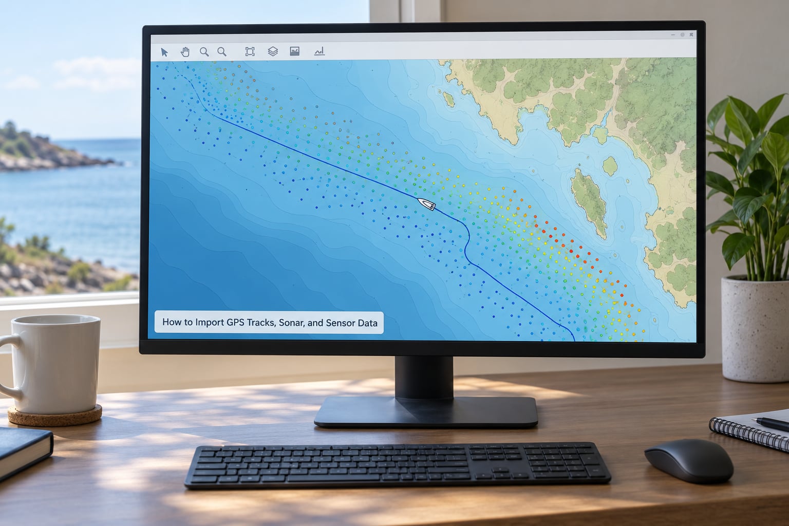
Start a new project with Project, New Project, then save it straight away. Drag a file from your file manager onto the map canvas and QGIS will guess the format; for anything unusual, go through the menu instead.
For a delimited file of soundings, choose Layer, Add Layer, Add Delimited Text Layer. In the dialog, set the X Field to the longitude column and the Y Field to the latitude column, leave the Geometry CRS set to the file’s own coordinate system, and click OK. QGIS asks about the delimiter and the geometry type (point, line or polygon) if it cannot work them out from the extension. You can tell it worked when the layer appears in the Layers panel and a preview of the first rows appears in the source preview pane.
For a GPX or KML track, use Layer, Add Layer, Add Vector Layer, pick the file, and select Track (lines) rather than Waypoints or Route Points in the Geometry Type dropdown. For a NetCDF cube, use Layer, Add Layer, Add Raster Layer, browse to the .nc file, and QGIS fills the band list with one entry per variable, such as thetao for potential temperature, uo and vo for the current components, and zos for sea surface height. Selecting a different band in the Rendering panel changes what you see; you can also use the dropdown next to the Raster dataset path to open the whole file in the dedicated NetCDF band properties dialog.
Finally, right-click any new layer and choose Zoom to Layer. If the canvas jumps somewhere unexpected rather than staying on your area of interest, you have already found your CRS problem and can move straight to the next step.
Set the Marine Data Coordinate Reference System
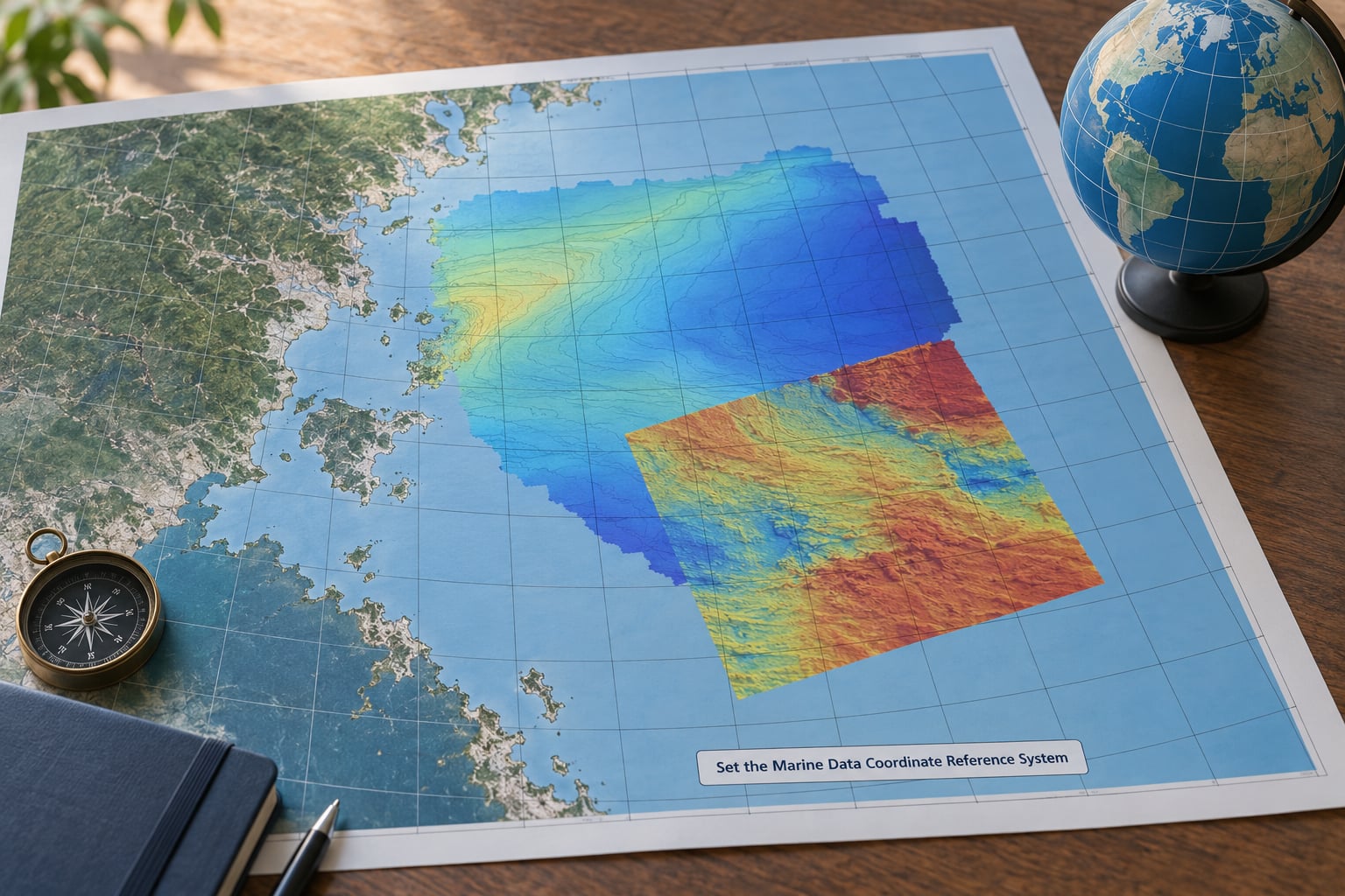
Every layer carries a coordinate reference system, and the project has one too. When they disagree, QGIS reprojects on the fly and the results can be subtly wrong rather than obviously broken. This is the single most common reason marine layers land in the wrong place.
To check a layer, open Layer Properties from the right-hand panel and read the Coordinate Reference System tab. It will say either a known authority definition, with an EPSG code, or a custom system. For a file that arrived as GeoJSON or WGS84 GPS data, you will normally see EPSG:4326, which stores coordinates in decimal degrees on the ellipsoid. If a dataset reports 0 to 360 longitude instead of -180 to 180, you have the wraparound problem: points east of the antimeridian read as huge positive values and the layer stretches off the right side of the world. The fix is to convert them with new_longitude = (longitude + 180) % 360 - 180 in the field calculator or the Python console, then reload.
To set a project CRS, open Project, Properties, then the CRS tab and pick the system your data and your audience will use. Geographic systems keep distances honest across a wide area but distort area and shape; projected systems such as the appropriate UTM zone or an equal-area projection preserve area and let you measure in metres. A UTM zone is convenient for a single estuary survey and awkward the moment your work crosses a zone boundary, which is a common situation with coastal work that runs along a national border. For anything spanning a coastline, an equal-area projection usually costs you less than you think.
The mistake to avoid is treating longitude and latitude as if they were planar coordinates. Averaging the longitude of two points either side of the prime meridian gives you the prime meridian, not the midpoint of the route, and the same trap catches anyone who computes a distance in degrees. If a tool asks for an output measurement in metres, the project needs a projected CRS first.
Clean and Check Marine Data
Survey data arrives with errors, and a map built on uncleaned points carries those errors into every downstream product. Budget thirty minutes for cleaning; it is the step people cut first and regret last.
Start with duplicates. Open the Processing Toolbox with the gear icon in the toolbar, search for Delete duplicate geometries, run it on the sounding points, and keep the original. Echosounder exports routinely repeat the last fix when the GPS drops out, so identical stacked points are normal rather than suspicious.
Next, check for spikes. A sound jump of tens of metres between two consecutive fixes is a bottom-return artefact, not a rock. The Marine Tools plugin, developed at the National Oceanography Centre in Southampton, includes a spike filter for exactly this, and the Processing toolbox has Remove Outliers methods as a fallback. Sort the attribute table by depth and scan the values; outliers cluster visibly at the shallow and deep ends, which is much faster than eye-checking a map.
Geometry repair comes next. Run the Processing algorithm Fix geometries, which closes unclosed rings and corrects self-intersections that break later operations like clipping and buffering. Then handle the timestamp field: check for null values with a filter on the attribute table, because a track with missing times cannot be animated or sorted chronologically.
Finally, confirm the data falls inside your study area. Use the vector overlay through Processing, Layer, Intersection, to clip the points against a survey boundary polygon, then count the output features. A count of zero means a CRS mismatch rather than an empty survey, and a count far below the raw total means the boundary is in the wrong datum.
Style Vessel Tracks and Sensor Observations
Default symbology in QGIS is chosen to be distinct on a map of anywhere, which means it is usually wrong for a track across one estuary. Setting your own renderer is the fastest way to a readable result.
To colour a track by speed, depth or sensor value, right-click the layer, choose Symbology, set Symbology Type to Graduated, pick the value field from the Values column, and set the ramp. Class boundaries can be set by Equal interval, which is honest about distribution, or Manual, which is what you want when the interesting break is at a specific depth, such as everything shallower than 10 m versus everything deeper.
To colour a track by a category such as survey line, day or vessel, use Categorized instead and leave the ramp alone. For routes, set the line width to something between 0.8 and 1.5 mm so lines stay visible when the map is scaled down, and avoid pure red for anything that will be printed in greyscale, which is still the default in many field reports.
For point observations of sensor readings, use graduated symbology with a graduated marker size so shallow points are visibly different from deep ones, and keep the size range narrow, roughly 1.5 mm to 4 mm, so the layer does not swamp the basemap. Apply labelling only to the points that matter: in the Labels tab, turn on Single Labels and set a rule expression such as "depth" < 5 so shallow stations are named and the rest stay quiet.
To check your choice, zoom the map to a familiar reach of coastline and look at the layer at 100 percent. If you cannot read the track or tell two classes apart, a reader in a report will not manage it either.
Analyze Routes, Coverage, and Spatial Relationships
Styling shows you where things are; analysis answers the questions the survey was run to answer. Most of the useful operations live in the Processing Toolbox.
Route distance comes from the field calculator or from the Basic Statistics for Fields panel on the track layer, summing the distance column a line layer carries. For coverage, build a buffer: Processing, Buffer, with a distance wide enough to represent your vessel’s line spacing plus a safety margin, then run Union on the buffered lines to dissolve overlaps. The result tells you which transects were effectively repeated and which gaps remain.
To isolate observations near a coastline, load a coastline or shoreline polygon as a second vector layer and use Processing, Points in polygon, or Clip the points to a land or boundary polygon instead. Where you want a simple answer rather than a new layer, the Select Features by expression tool in the attribute toolbar takes a spatial expression directly, such as $distance from a coastline vertex, which is enough for a first pass.
Comparing overlapping survey layers is straightforward once both are in the same CRS: put the older survey underneath, switch the newer one to 50 percent opacity, and look for the offset. The Processing tool Difference computes it numerically, and running a Zonal Statistics algorithm over a depth zone polygon gives you the mean or minimum depth per zone for a report table.
Export a Marine Map for Reports or Field Use
Do not send a screenshot to anyone. Build a print layout instead, which keeps the styling, the scale and the attribution with the map.
Open Project, New Print Layout, choose the orientation and the paper size, then use the layout toolbar to add a map item, a legend, a scale bar and a north arrow. Right-click the map item and choose Set Map Extent by Layers to frame your data, and set the map item’s CRS to match the project so the graticule is correct. Add a label for the title and a second label for the data source and the date of the survey, with a short line on the vertical datum and the depth sign convention.
To export, choose Export as PDF for a print-ready file, and set the resolution to 300 dpi if the file is going to a plotter. For a reusable dataset, use the Processing toolbox algorithm Package layers instead, which writes a GeoPackage containing all the layers, styles and metadata in one file that another QGIS user can open without re-styling.
Common Mistakes
Almost every QGIS marine problem falls into one of six categories, and all six have the same fix pattern: identify the symptom, find which assumption is wrong, change that one thing.
| Symptom | What is actually wrong | The fix |
|---|---|---|
| Layer loads but the canvas is empty | You are zoomed somewhere else, or the layer sits outside the project extent | Right-click the layer and choose Zoom to Layer, then check the layer CRS in Layer Properties |
| Points appear off the coast, or in the wrong ocean | Longitude stored 0 to 360 instead of -180 to 180, or a datum mismatch | Convert with (longitude + 180) % 360 – 180, and confirm the datum of both layers |
| Track breaks into disconnected fragments | GPS dropouts written as separate features, or unfixed geometry | Run Fix geometries, then merge lines with the Lines to Lines tool in the topology section |
| Every feature is the same colour | Automatic symbology applied with no value field, or you picked a band with no data | Set Symbology Type to Graduated or Categorized and choose the field or band explicitly |
| Timestamps missing or out of order | Sensor written local time while GPS wrote UTC, or the log never wrote a time field | Check the file header for a time offset and normalise the column before styling by date |
| Distances and areas look absurd | You measured in degrees on a geographic CRS | Set the project to a projected CRS in metres, then reproject the layer and measure again |
| Map is unreadable at print size | Symbology set on screen, not on the printed page; contours too dense | Work in the layout at final scale, and thin contour intervals until the lines separate at that size |
One habit catches most of these before they reach a report: after every change, zoom to the full extent with Project, Zoom Full and check that each layer lands where you expect. A blank legend entry, a layer sitting at 1:50 million scale, or a missing source line in the layout are all visible in seconds and expensive to miss.
The second habit is to save versions. Marine analysis is iterative, the contour interval almost always needs a second pass, and having the pre-cleaning project to go back to is the difference between a five-minute fix and a re-import.
Frequently Asked Questions
Is QGIS hard to use for marine data?
QGIS has a real learning curve, but marine data follows one of the shorter paths through it. Loading a NetCDF grid, choosing a band and applying a colour ramp takes a few minutes once you have done it once. The genuinely difficult parts are coordinate reference systems and cleaning messy survey data, and both are real data problems rather than software problems. Budget a day of practice before you are comfortable, not a month.
Can QGIS read NetCDF files?
Yes, and it reads them natively through GDAL without any conversion step. Go to Layer, Add Layer, Add Raster Layer, select the .nc file, and QGIS lists every variable as a separate band you can pick in the Rendering panel. For a cube with a time dimension, use the temporal options in the layer source to choose the date, or install the NetCDF2QGIS plugin to get one layer per variable with time as a field.
How do I get water depth data into QGIS?
Download a bathymetric grid from a free portal such as EMODnet Bathymetry, GEBCO or a national hydrographic office service, and subset it to your bounding box before downloading so you do not fetch a global grid. Load it with Layer, Add Layer, Add Raster Layer, apply a colour ramp with deeper values darker, then run the contour algorithm to add depth contours. For your own soundings, use Add Delimited Text Layer with X and Y set to the coordinates.
Is QGIS better than Google Earth for ocean data?
They do different jobs. Google Earth is a viewer for imagery and terrain, useful for getting your bearings quickly and for checking a site in three dimensions. QGIS is the analysis environment: it controls the coordinate reference system, runs spatial operations such as clipping and buffering, batches processing and produces print layouts with legends and scale bars. Use Google Earth for context, and QGIS for anything you have to measure, style or export.
Do I need a paid licence to use QGIS for marine data?
No. QGIS is free and open source under the GNU General Public Licence and runs on Windows, macOS and Linux. The marine data it consumes is also free: EMODnet, GEBCO, Marine Regions and the national hydrographic services all provide open access, and Copernicus Marine requires registration rather than payment. Costs only appear if you choose commercial training or a commercial licence such as ArcGIS Pro.
Why is my QGIS layer blank after I add it?
In most cases the layer has loaded correctly and is simply outside your current view, so right-click it and choose Zoom to Layer. If it still shows nothing, compare the layer CRS in Layer Properties against the project CRS, confirm you selected a band or attribute that actually holds values, and check for a NoData problem or 0 to 360 longitudes shifting the geometry past the antimeridian.
Conclusion
The workflow reduces to six moves: import through the right menu, set the coordinate reference system before anything else, clean the points, style by the value you care about, run the spatial operation your question needs, and lay the result out properly. Each one is checkable in seconds if you look for the confirmation, and every one of them is free.
Start small. Open QGIS, create a new project, import one representative file of your own data, confirm its CRS, and style it until it reads well at full zoom. Only then add the second layer, because a correctly styled single layer is worth more than a fast sequence of layers built on a wrong assumption. The guide updated for 2026 reflects the QGIS 3.x desktop interface, and menu names shift slightly between releases, so check the dialog titles against your version as you go.